20 Two Tone Kitchen Cabinet Ideas That’ll Totally Transform Your Space
Hey Friend, Let’s Talk Two-Tone Cabinets…
Okay, confession time: I never thought I’d be into two-tone kitchen cabinets, until I tried it myself. And wow, what a game-changer!
If your kitchen’s feeling a little flat or one-dimensional, two-tone cabinets are seriously the easiest (and prettiest) way to give it some personality.
They’re fresh, super customizable, and they make even small kitchens feel thoughtfully styled.
Whether you’re leaning farmhouse, coastal, modern, or classic, I promise, there’s a two-tone combo out there that’ll feel so you.
Why Two-Tone Kitchen Cabinets Are So Worth It
Honestly, the beauty of two-tone cabinets goes beyond aesthetics. It’s like giving your kitchen an instant facelift without going full-reno mode (because nobody wants to be living out of takeout boxes for weeks!).
Here’s what makes two-tone cabinets such a fan favorite:
- Visually expands your space, Lighter uppers + darker lowers create depth and open things up.
- Adds personality without chaos, You can play with contrast or stick to subtle tones. It’s super customizable!
- Highlights focal points, Want your island to pop? Or draw eyes to a gorgeous range hood? Two-tone it.
- Gives you modern flair, Even traditional kitchens feel updated with a clever color split.
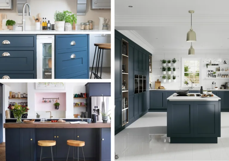
I personally went with navy lowers and white uppers, and let me tell you, it still makes me smile every time I walk in.
1. White Uppers + Navy Lowers
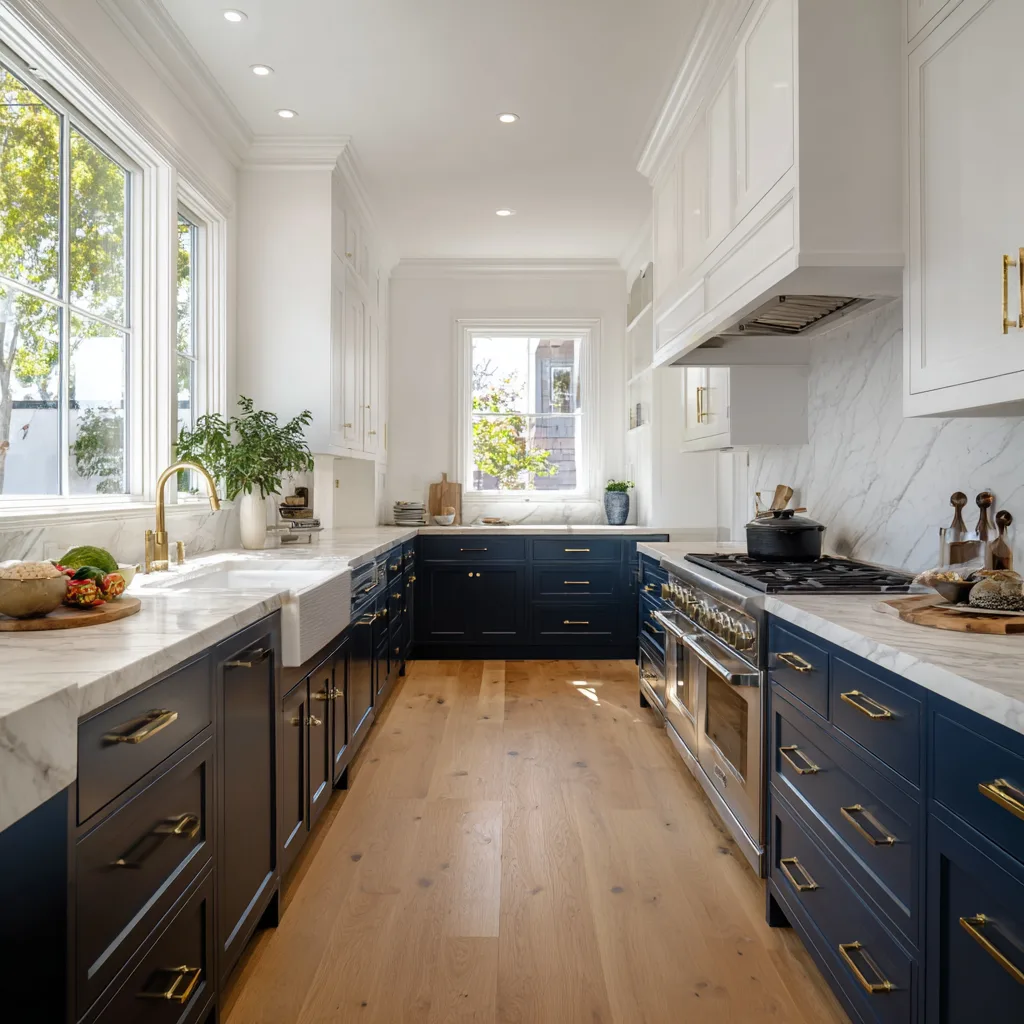
Classic, bold, and a little coastal, it’s one of my favorite combos. I chose this in my own kitchen and it instantly made everything feel more grounded and airy at the same time.
- White helps bounce light around your space.
- Navy blue feels strong and adds a bit of drama (in the best way).
- Bonus: Navy hides scuffs and fingerprints like a pro!
Design Tips:
- Pair with brushed gold or brass hardware for warmth.
- Add a white marble or quartz countertop to tie it all together.
2. Greige + Soft Sage Green
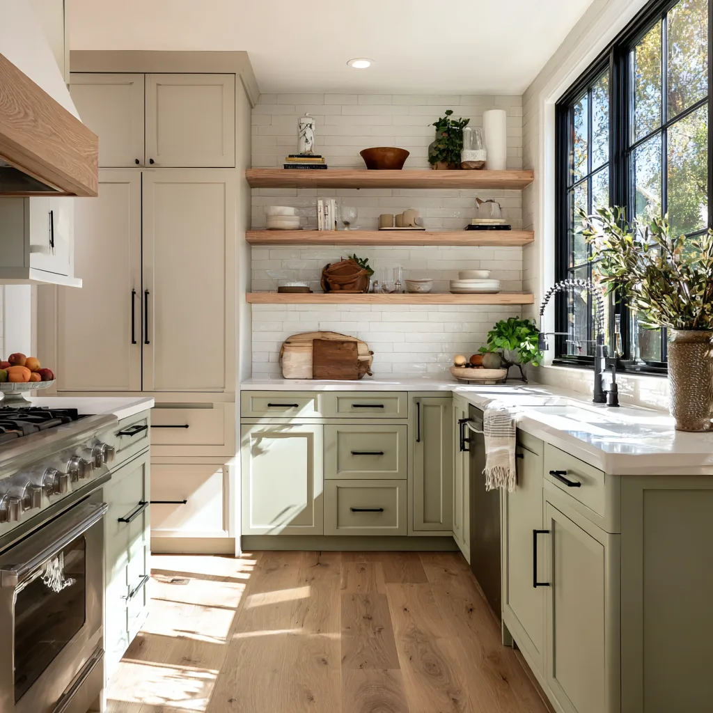
I love this one for its earthy, calming vibe. If you’re into biophilic design or want a more natural, spa-like kitchen, this pairing is chef’s kiss.
- Greige (gray + beige) on top keeps it light but not stark.
- Sage green on the bottom brings the outdoors in.
Design Tips:
- Use open wood shelving to add texture.
- Finish with matte black hardware for contrast.
3. Matte Black + Wood Grain

Talk about sleek! This combo is perfect if you’re going for modern rustic or even a touch of industrial.
- Matte black upper cabinets look polished and edgy.
- Natural wood grain lower cabinets keep it warm and approachable.
Design Tips:
- Keep countertops and backsplash light to balance the dark tones.
- Add under-cabinet lighting to keep it from feeling heavy.
4. Light Blue + Crisp White

If your kitchen makes you dream of beach getaways (guilty!), then this color combo will totally make you swoon.
- White uppers give that classic, clean look.
- Light blue lowers feel breezy and serene.
Design Tips:
- Works beautifully with shiplap walls or beadboard detailing.
- Pair with rattan stools or coastal accents for that relaxed vibe.
5. Forest Green + White
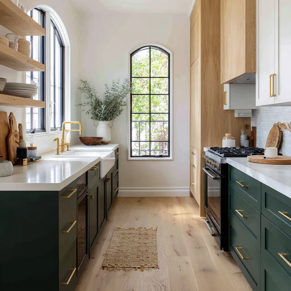
Oh my word, this one’s a showstopper. Deep green lowers make a bold statement, while white uppers balance everything out.
- White cabinets keep the space light and breathable.
- Forest green adds depth and sophistication.
Design Tips:
- Use brushed brass hardware to warm things up.
- Add wood accents (like shelves or a hood cover) for texture.
6. Charcoal + Pale Gray

This is your go-to for a sleek, modern look that still feels cozy.
- Pale gray uppers soften the overall aesthetic.
- Charcoal gray lowers ground the space and add a moody touch.
Design Tips:
- Use stainless steel or black hardware for a minimalist finish.
- Incorporate clean lines and minimal fuss in decor.
7. Dusty Rose + Cream
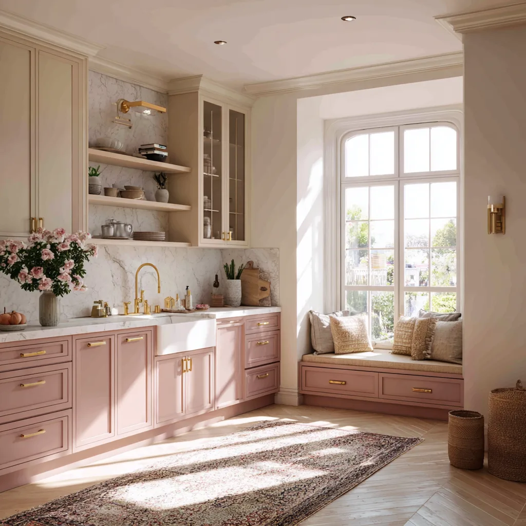
Yup, pink in the kitchen—and it works so well! This one’s for you if you’re feeling playful, romantic, or just want something different.
- Cream uppers are soft and subtle.
- Dusty rose lowers are fun without screaming Barbie Dreamhouse.
Design Tips:
- Add gold or rose gold hardware to glam it up.
- Keep the rest of your palette neutral for balance.
8. Bold Yellow + Gray
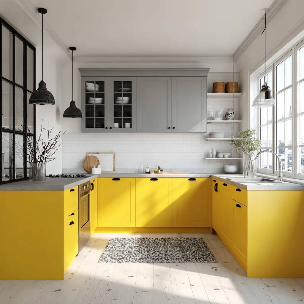
Okay, I’ll admit—I was skeptical about yellow too. But when it’s paired with the right neutral, it’s sunny, not blinding.
- Gray uppers tone things down just enough.
- Bold yellow lowers add instant cheer and vibrance.
Design Tips:
- Keep backsplash and countertops minimal.
- Use black accents for contrast and definition.
9. Black Uppers + Soft Taupe Lowers
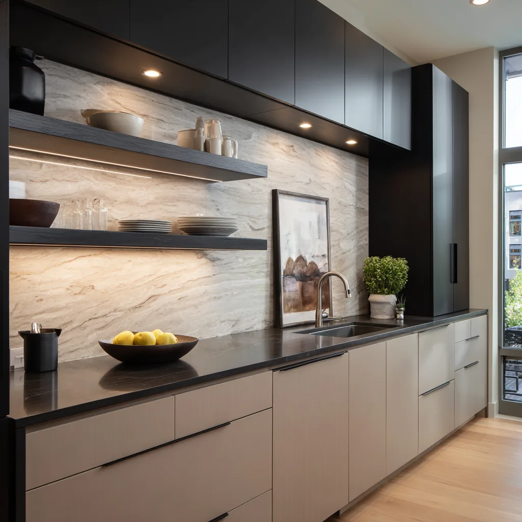
This is such a chic, unexpected reversal of the usual light-on-top look. It works especially well in well-lit spaces or with glass-front cabinets.
- Black uppers bring in a sophisticated edge.
- Taupe lowers keep things warm and approachable.
Design Tips:
- Consider matte finishes for a more modern feel.
- Try integrated lighting inside upper cabinets for glow.
10. White + Natural Wood Island
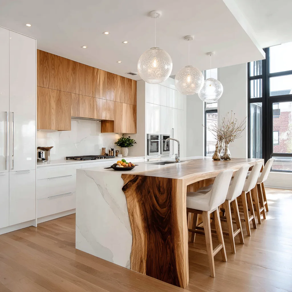
Not ready to commit to two-tone everything? Try just doing the island! This is a safe but super stylish way to ease into the trend.
- White perimeter cabinets keep the space fresh and timeless.
- Natural wood island adds warmth and becomes the focal point.
Design Tips:
- Use waterfall countertops to make the island pop.
- Pair with stools in a similar wood tone for cohesion.
11. Deep Teal + Cream
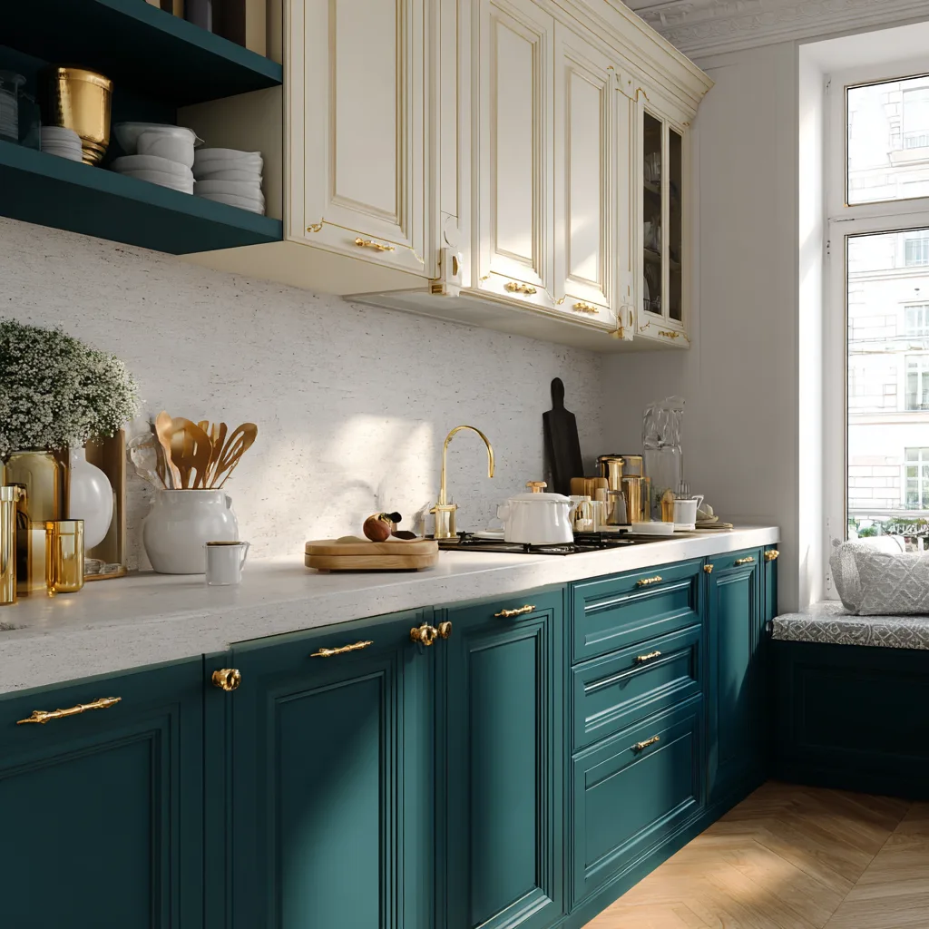
If you’re craving something rich but still calm, deep teal paired with warm cream is the perfect combo. It’s dramatic without feeling overbearing, and it looks so luxe.
- Teal lowers bring depth and a cool elegance.
- Cream uppers keep it airy and softly warm.
Design Tips:
- Use gold hardware to bring out the richness of teal.
- A warm wood or light marble countertop works beautifully.
12. Olive Green + Buttery Beige
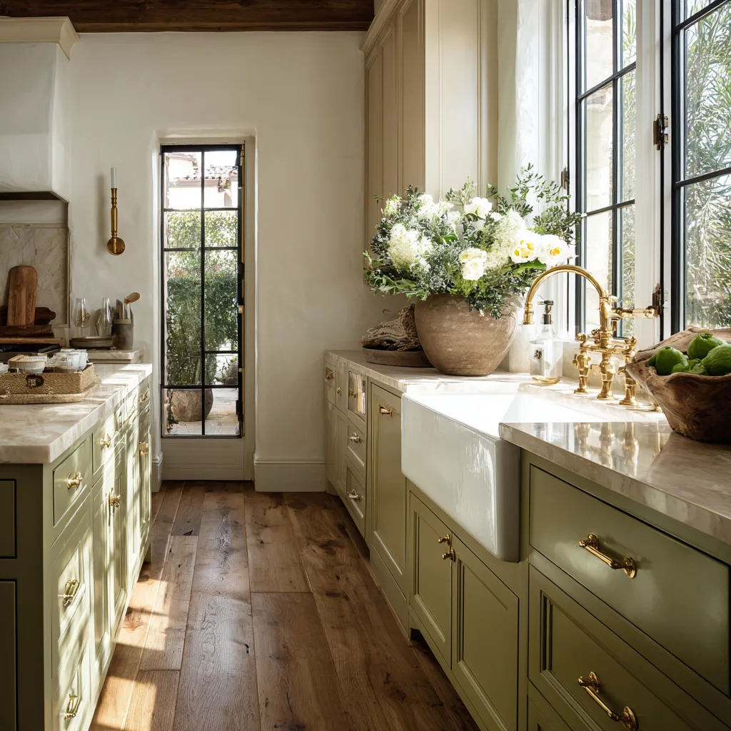
This combo feels like a warm hug from your favorite farmhouse kitchen—rustic but polished. It’s perfect if you love a lived-in, cozy feel.
- Olive green lowers ground the space and add character.
- Buttery beige uppers soften everything with warmth.
Design Tips:
- Incorporate copper or brass accents to elevate the charm.
- Add reclaimed wood shelves or vintage-style lighting.
13. Cobalt Blue + Whitewashed Oak

If you’re into bold but refined, cobalt blue paired with whitewashed oak totally delivers that wow factor. It’s high energy with a touch of natural calm.
- Cobalt blue injects color and vibrance.
- Whitewashed oak tones it down with soft texture.
Design Tips:
- Choose sleek, modern hardware in matte black or silver.
- Keep backsplash and decor minimal to let the cabinets shine.
14. Blush Pink + Charcoal

Unexpected? Yes. Stunning? Absolutely. Blush pink and charcoal bring a surprising level of elegance that works especially well in contemporary kitchens.
- Charcoal lowers feel moody and sleek.
- Blush uppers add a soft, warm contrast without feeling overly feminine.
Design Tips:
- Try flat panel cabinetry for a clean, modern finish.
- Add metallic touches like copper or brushed gold.
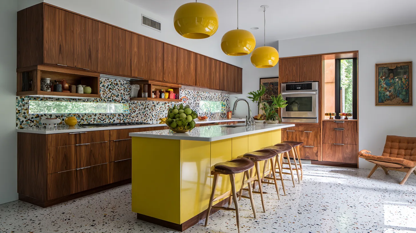
15. Mustard Yellow + Deep Walnut
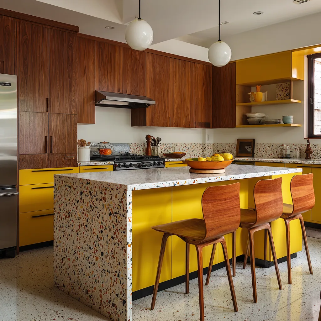
Ready for a bold choice? This one’s packed with retro charm but feels modern when done right. Mustard and walnut together just scream personality.
- Mustard lowers bring in a pop of fun.
- Deep walnut uppers offer richness and balance.
Design Tips:
- Works great with terrazzo countertops or colorful tile backsplashes.
- Keep the rest of your space neutral to avoid visual overload.
16. Warm Taupe + Dusty Blue
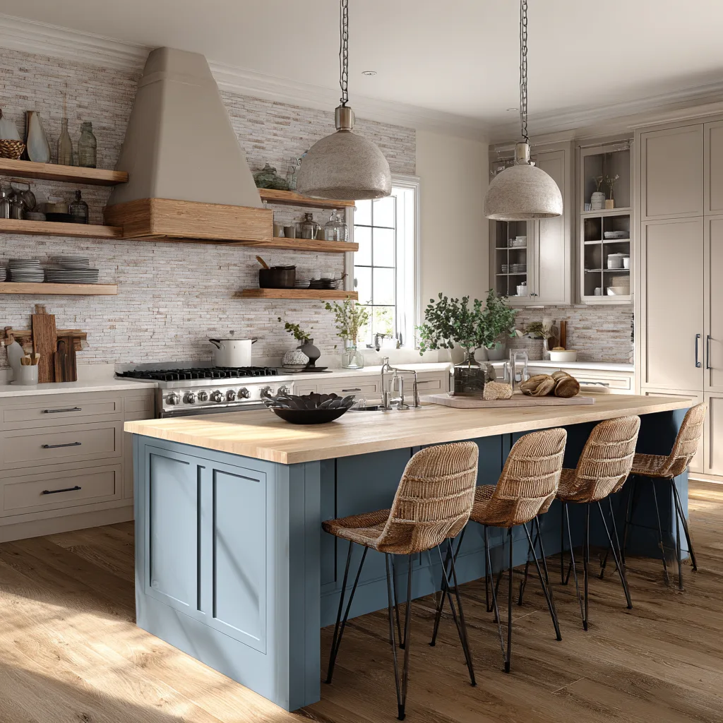
This is one of those underrated pairings that surprises you in the best way. It’s calming, cozy, and quietly stylish.
- Dusty blue lowers bring in subtle charm.
- Warm taupe uppers create a cozy, welcoming feel.
Design Tips:
- Use matte finishes for a relaxed vibe.
- Mix in ceramic or vintage-style hardware for added detail.
17. Soft Mint + Light Maple

Fresh, bright, and just a little retro—this combo feels like spring all year long. It’s especially lovely in smaller kitchens or breakfast nooks.
- Soft mint adds a cheerful, refreshing vibe.
- Light maple keeps it grounded and organic.
Design Tips:
- Pair with white countertops and minimal backsplash.
- Add chrome hardware for a mid-century nod.
18. Clay Terracotta + Vanilla Cream

I’m obsessed with this earthy, desert-inspired pairing. It’s warm, grounded, and has this sun-kissed vibe that works beautifully with natural light.
- Clay-toned lowers feel rich and organic.
- Vanilla cream uppers soften and brighten the palette.
Design Tips:
- Use raw wood or concrete countertops for contrast.
- Bring in greenery or terracotta planters for extra cohesion.
19. Indigo + Pale Lilac
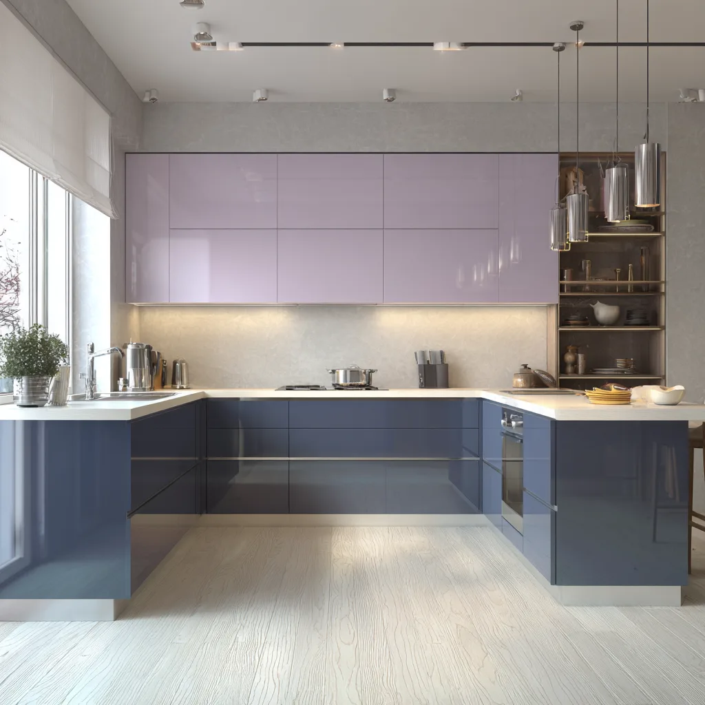
Feeling adventurous? This moody-meets-soft pairing is like the fashion-forward version of two-tone kitchens. Surprisingly beautiful, especially in creative homes.
- Indigo lowers add depth and mystery.
- Pale lilac uppers offer an unexpected whisper of color.
Design Tips:
- Choose high-gloss uppers for light reflection.
- Complement with sleek black hardware and white countertops.
20. Gunmetal Gray + Glossy White
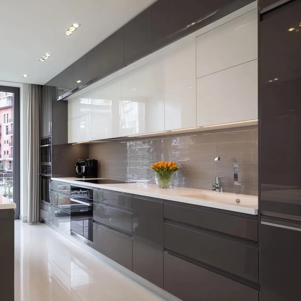
This one’s all about high contrast, high shine, and modern elegance. If you’re aiming for a clean and luxurious look, this is your match.
- Gunmetal gray lowers feel strong and sophisticated.
- Glossy white uppers bounce light and expand the space.
Design Tips:
- Add glass or high-gloss backsplash tiles for more shine.
- Choose handleless cabinetry for a seamless, modern finish.
Common Mistakes to Avoid with Two-Tone Cabinets
Alright, let’s keep it real, two-tone can go wrong if you’re not careful. I made a few of these missteps myself (oops), so here’s what to watch out for:
- Too much contrast, Bright red and jet black? That’s a lot. Stick with tones that complement each other.
- Neglecting balance, One color shouldn’t overpower the other. Think light + grounding.
- Ignoring hardware and finishes, They should harmonize with your cabinet colors. Don’t make them an afterthought!
- Forgetting flow, Your two-tone look should work with the rest of your home. Try pulling tones from nearby spaces.
Ready to Paint Some Personality into Your Kitchen?
If your kitchen’s been feeling a little… meh, a two-tone cabinet setup might just be what it needs. It’s such a fun, impactful change, and honestly, one of the most budget-friendly ways to refresh your space without a full gut job.
I loved the process of choosing my own combo (white + navy forever!), and I’d do it again in a heartbeat. Whether you go bold, neutral, or soft and sweet, there’s no wrong way to two-tone.
So go ahead, grab a paint sample (or five), and let your creativity lead the way. Your future kitchen is going to look so good

