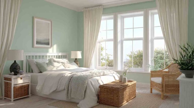
22 Relaxing Bedroom Paint Colors Interior Designers Swear By for Better Sleep
Ever walk into a room and just breathe easier? That’s the power of the right paint color.
I remember repainting my own bedroom from a harsh red to a cool, misty blue, and suddenly, I was falling asleep faster, waking up calmer, and actually enjoying being in my room again.
If your bedroom doesn’t feel like a retreat, the color might be the problem. So let’s fix that together, yeah?
I’ve rounded up 22 bedroom paint colors that are proven to calm your senses and elevate your space, whether you’re going for coastal calm, warm and cozy, or spa-like serenity.
Why the Right Bedroom Paint Color Is a Total Game-Changer
Let’s be real, your bedroom should be your sanctuary. It’s where you reset after a long day, and where your mind needs to let go. But too often, we pick colors that are trendy, not restful.
Here’s why choosing a relaxing paint color actually matters:
- Color impacts mood – Soft tones can reduce anxiety, while bold colors may keep your brain buzzing.
- It affects sleep – Colors like blue, green, and lavender are linked to better sleep quality.
- Aesthetic harmony = mental clarity – A well-balanced bedroom just feels better. Trust me.
So whether you’re starting fresh or giving your space a mini makeover, color is a powerful tool. Now let’s jump into my favorite chill-out shades.
1. Soft Sage Green
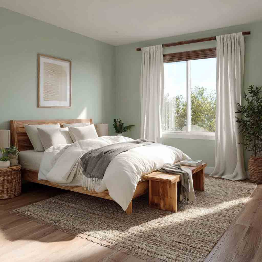
There’s something instantly grounding about sage green.
It reminds me of nature hikes and fresh morning air. It’s peaceful without feeling cold, and it pairs well with wood, whites, and natural textures.
Why it works:
- Brings calming nature vibes indoors
- Balances warm and cool lighting beautifully
- Perfect for minimalist or boho bedrooms
Design Tips:
- Pair with linen bedding and rattan accents.
- Use matte or eggshell finishes for a soft, diffused look.
- Looks gorgeous with off-white trim.
2. Warm Taupe

Taupe doesn’t get enough love, but let me tell you, it’s the hug in a color we all need.
It has cozy undertones without being too yellow or too gray. It feels grounded, warm, and lived-in.
Why it works:
- Offers a neutral backdrop without looking sterile
- Works with both modern and traditional decor
- Reflects soft light, making the room feel warm
Design Tips:
- Mix in woven textures and warm white lighting.
- Layer it with earthy browns and dusty pinks.
- Great with wood floors or beige carpet.
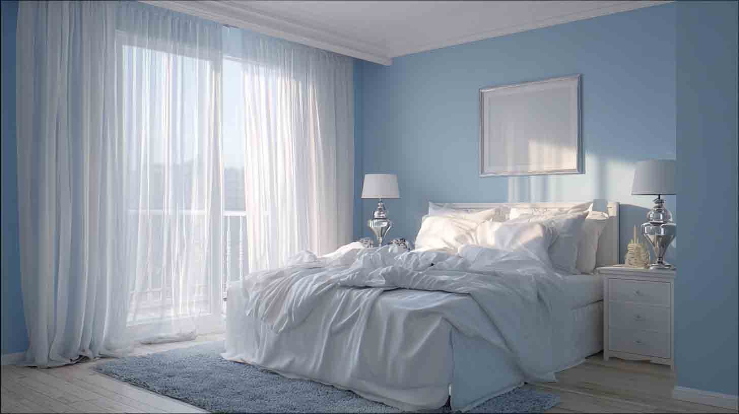
3. Misty Blue
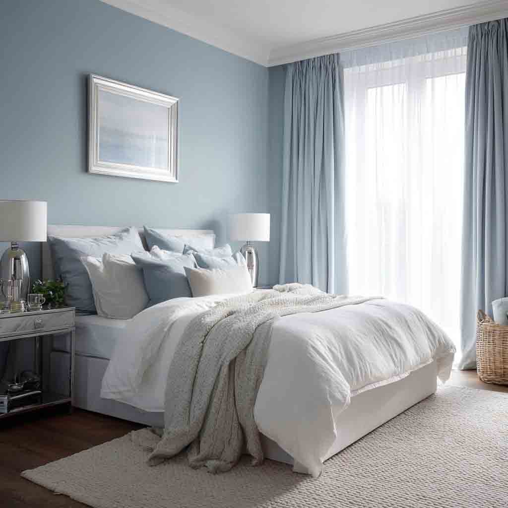
Misty blue is my go-to when someone wants something light, but not boring. It’s that gentle, whispery blue that almost feels like fog in the morning.
Why it works:
- Promotes relaxation and mental clarity
- Has cool undertones that make a space feel fresh
- Great for small rooms that need a bit of lift
Design Tips:
- Use it with white bedding and silver accents.
- Add a chunky knit throw for texture.
- Try painting just one accent wall if you’re hesitant.
4. Dusty Rose
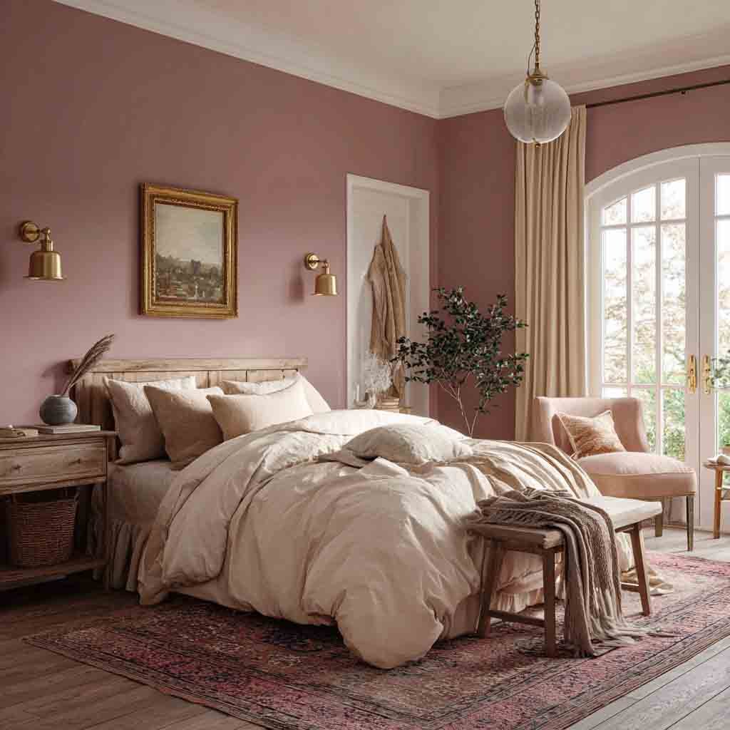
Okay, don’t scroll past this one. I used to think pink was too much for a bedroom, until I tried dusty rose.
It’s muted, romantic, and surprisingly versatile.
Why it works:
- Adds warmth and softness without being overly feminine
- Looks great in natural and artificial light
- Encourages feelings of calm and comfort
Design Tips:
- Pair with soft gray or cream-colored bedding.
- Add a touch of brass or gold for elegance.
- Works beautifully with vintage or cottage-style decor.
5. Classic Navy
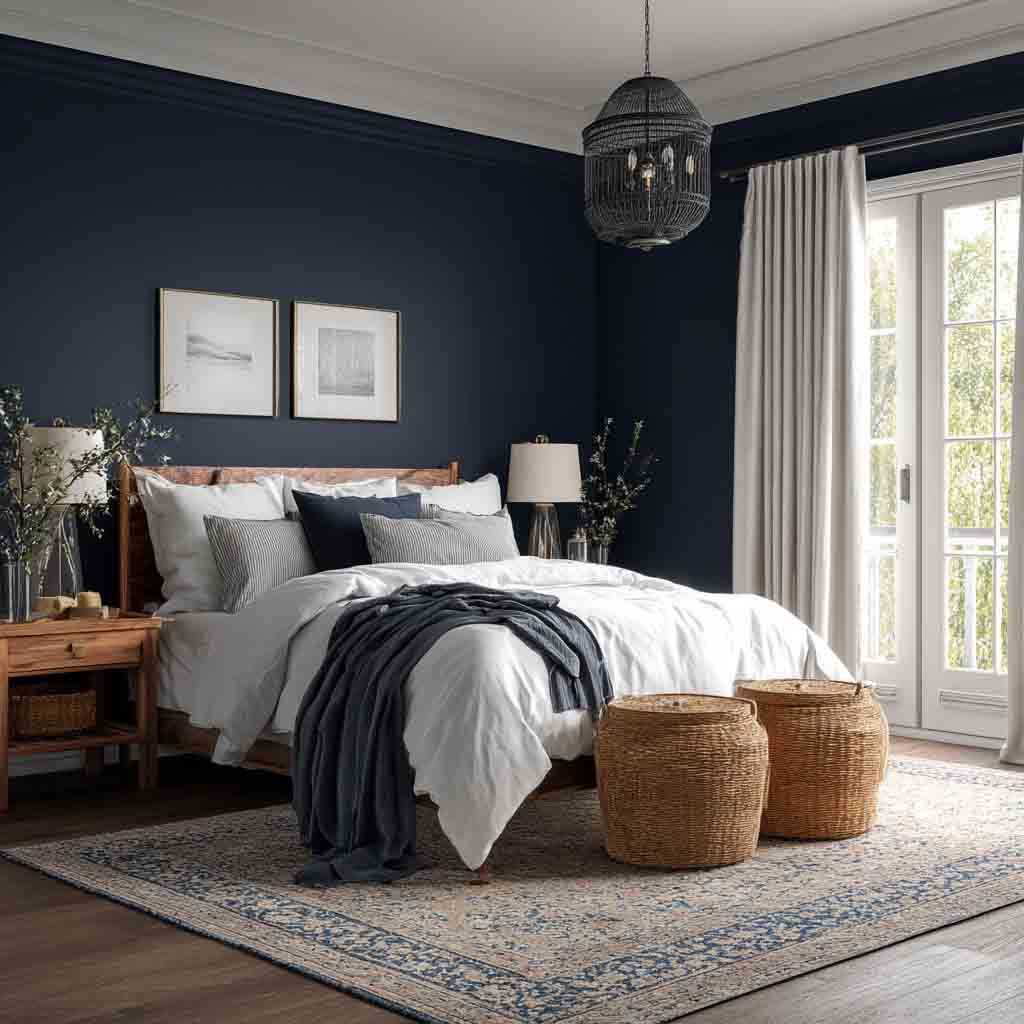
Navy in a bedroom? YES. It’s bold but calming, moody yet classic. And when paired with the right lighting, oh boy, it becomes a cocoon of coziness.
Why it works:
- Creates a grounding and secure atmosphere
- Helps your space feel intimate and restful
- Pairs beautifully with crisp whites and metallics
Design Tips:
- Try navy behind the headboard only.
- Add white bedding and natural wood for contrast.
- Perfect for bedrooms with high ceilings.
Also Read – 12 Best Paint Colors For Small Bedrooms
6. Pale Lavender
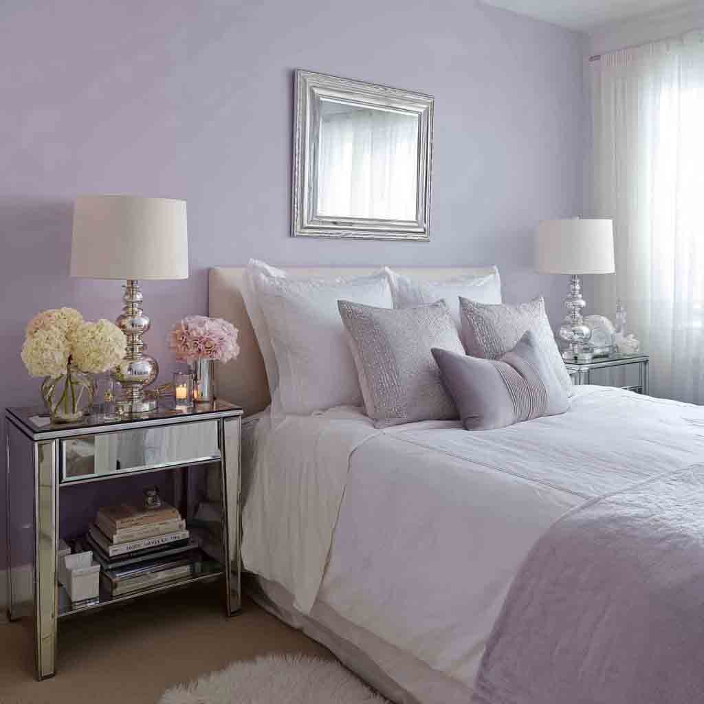
Lavender isn’t just for old-school bathrooms anymore. Today’s pale purples have gray undertones that make them seriously dreamy.
Why it works:
- Has stress-reducing and calming properties
- Feels luxurious without being overpowering
- Adds a gentle pop of color in soft, subtle ways
Design Tips:
- Combine with creamy whites and soft textures.
- Add lavender-scented candles for a sensory match.
- Works especially well with silver or mirrored furniture.
7. Greige (Gray + Beige)
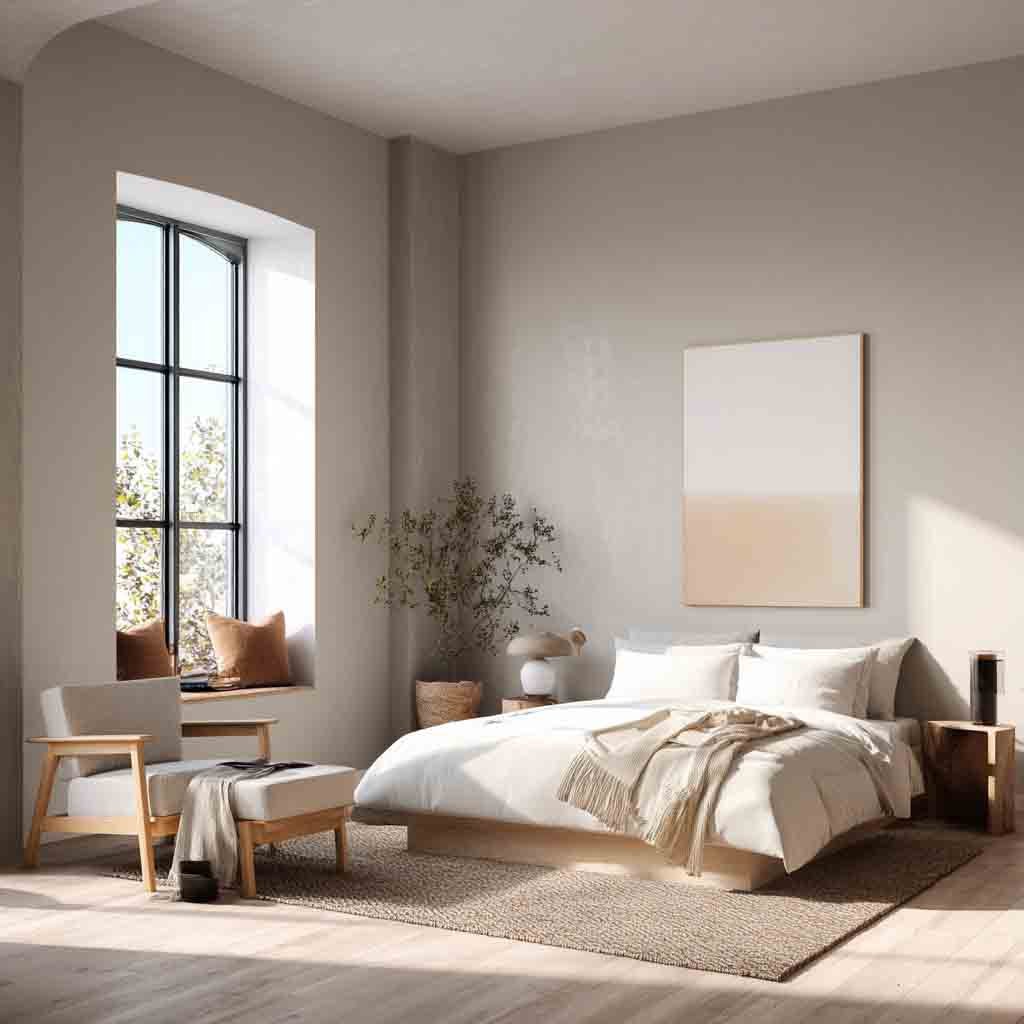
Greige is like the Switzerland of bedroom colors, it plays nice with everything.
When I painted my guest room greige, I was amazed at how neutral-yet-cozy it looked, no matter the lighting or decor.
Why it works:
- Offers warmth with a modern edge
- Adapts to changing light throughout the day
- Ideal for transitional or Scandinavian styles
Design Tips:
- Pair with white, rust, or charcoal accents.
- Keep decor minimal to let the color shine.
- Great base for seasonal decor swaps.
8. Sky Blue
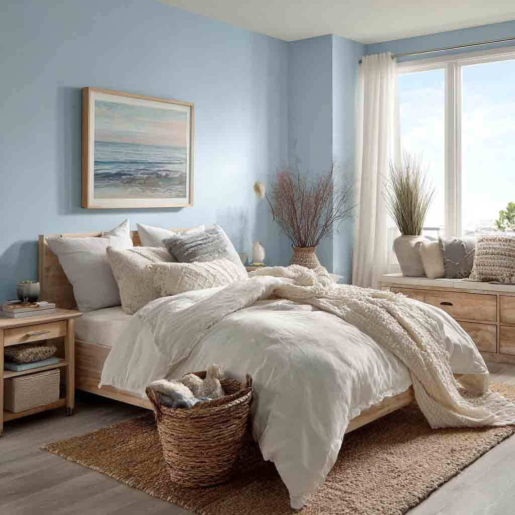
Imagine laying on your bed, staring up at the ceiling, and it feels like the sky. That’s what sky blue does.
It’s fresh, youthful, and instantly calming.
Why it works:
- Creates a light and airy vibe
- Helps rooms feel more spacious
- Encourages mental tranquility
Design Tips:
- Use white trim for crisp contrast.
- Add a fluffy rug to keep things cozy.
- Pairs well with coastal or farmhouse decor.
9. Creamy Off-White
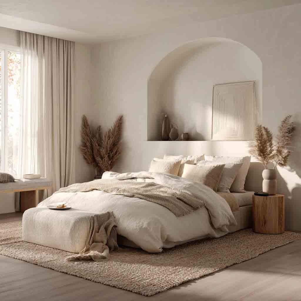
Sometimes, simplicity is the answer. A soft, creamy off-white never goes out of style.
It’s not stark or cold like pure white, it has a hint of warmth that makes everything feel gentler.
Why it works:
- Reflects natural light beautifully
- Feels clean without being clinical
- Lets your furniture and decor stand out
Design Tips:
- Layer with beige, tan, and ivory tones.
- Use varied textures, think knit, jute, and wood.
- Ideal for minimal, airy bedrooms.
10. Charcoal Gray

Charcoal gray is bold, moody, and weirdly calming. It’s like turning your bedroom into a secret den, and honestly? I love it.
Why it works:
- Helps reduce overstimulation at night
- Feels modern, masculine, and grounded
- Creates contrast with lighter furniture and bedding
Design Tips:
- Use matte finishes to soften the look.
- Brighten with light bedding and pops of color.
- Try it in larger rooms or with lots of natural light.
11. Muted Terracotta
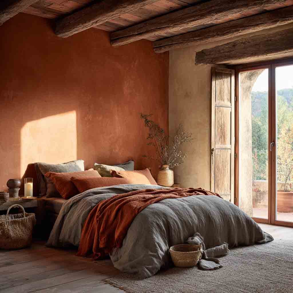
Muted terracotta has that soft sunbaked quality that instantly adds warmth and earthiness. It’s not loud like orange, but instead feels cozy and grounded.
Why it works:
- Feels organic and comforting, like a desert sunset
- Adds depth without overpowering
- Pairs beautifully with rustic or earthy decor
Design Tips:
- Match with natural wood tones and cream bedding
- Add clay pots or woven baskets for texture
- Great for southwest, Mediterranean, or boho vibes
12. Powder Gray
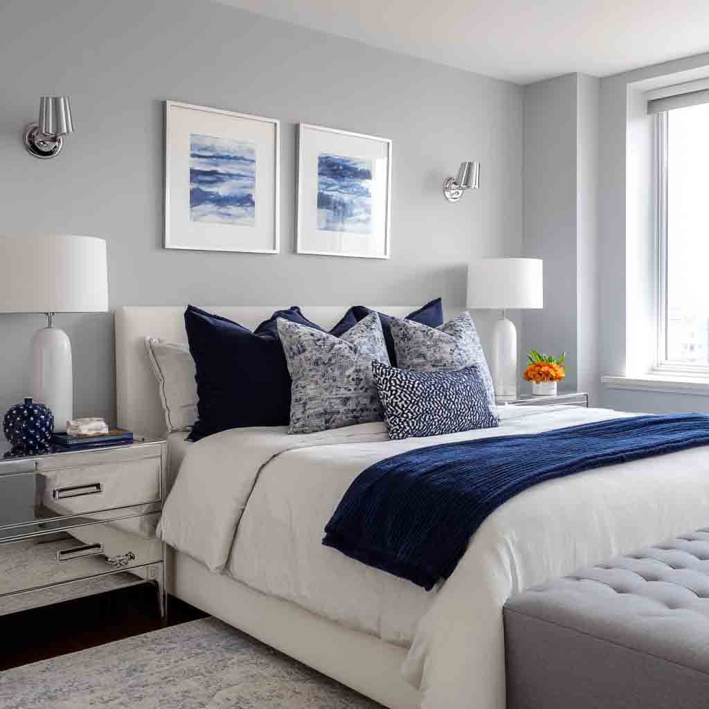
Powder gray is the ultimate soft neutral. It’s lighter than charcoal, warmer than icy gray, and totally timeless.
Why it works:
- Offers a cool, peaceful base for any style
- Doesn’t clash with bolder furniture or art
- Has a sleek, modern feel without being stark
Design Tips:
- Combine with white or navy for a clean look
- Accent with glass or chrome for a modern touch
- Works beautifully with both natural and artificial light
13. Soft Peach
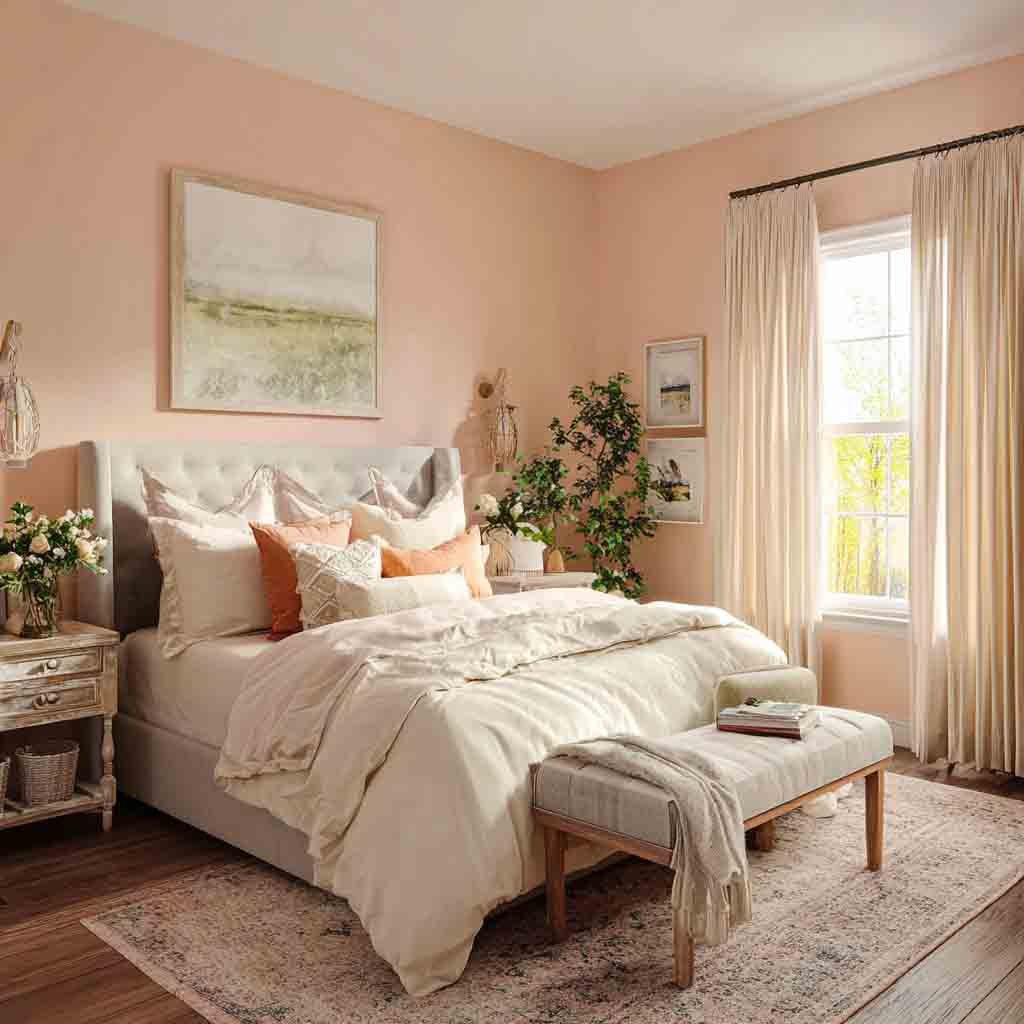
If you’ve ever watched a peachy sunset, you know how comforting this shade can feel. Soft peach adds a gentle glow to your space.
Why it works:
- Feels inviting, gentle, and nurturing
- Brings in light warmth without being too pink
- Looks especially dreamy in morning light
Design Tips:
- Pair with ivory, light brown, and soft green
- Works well with vintage or romantic decor
- Add lace or linen accents for extra softness
14. Cool Mint
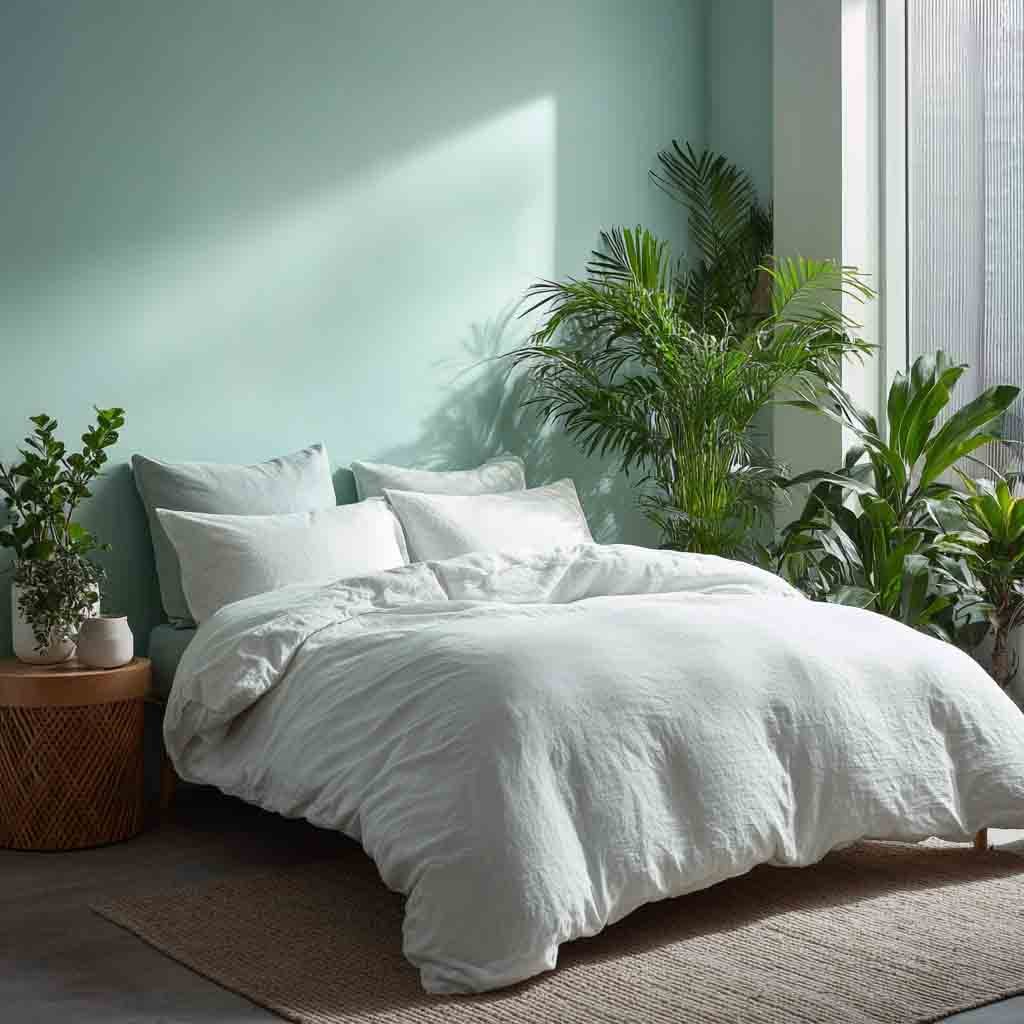
Cool mint has this spa-like clarity that just refreshes your whole mood. It’s soft, light, and energizing—without being bright.
Why it works:
- Feels clean, calm, and restorative
- Reflects natural light to make the room feel bigger
- Perfect for spring-inspired spaces
Design Tips:
- Combine with pale wood and crisp white bedding
- Add leafy plants for natural accents
- Great for beachy or minimalist decor themes
15. French Blue

French blue has that elegant, old-world charm without being too fancy. It’s somewhere between a faded denim and a cloudy sky.
Why it works:
- Adds a touch of sophistication and serenity
- Deep enough for mood, light enough for calm
- Looks gorgeous in traditional or cottagecore rooms
Design Tips:
- Accent with cream, brass, or floral patterns
- Works beautifully with whitewashed wood
- Add layered curtains for a soft, romantic look
16. Olive Green
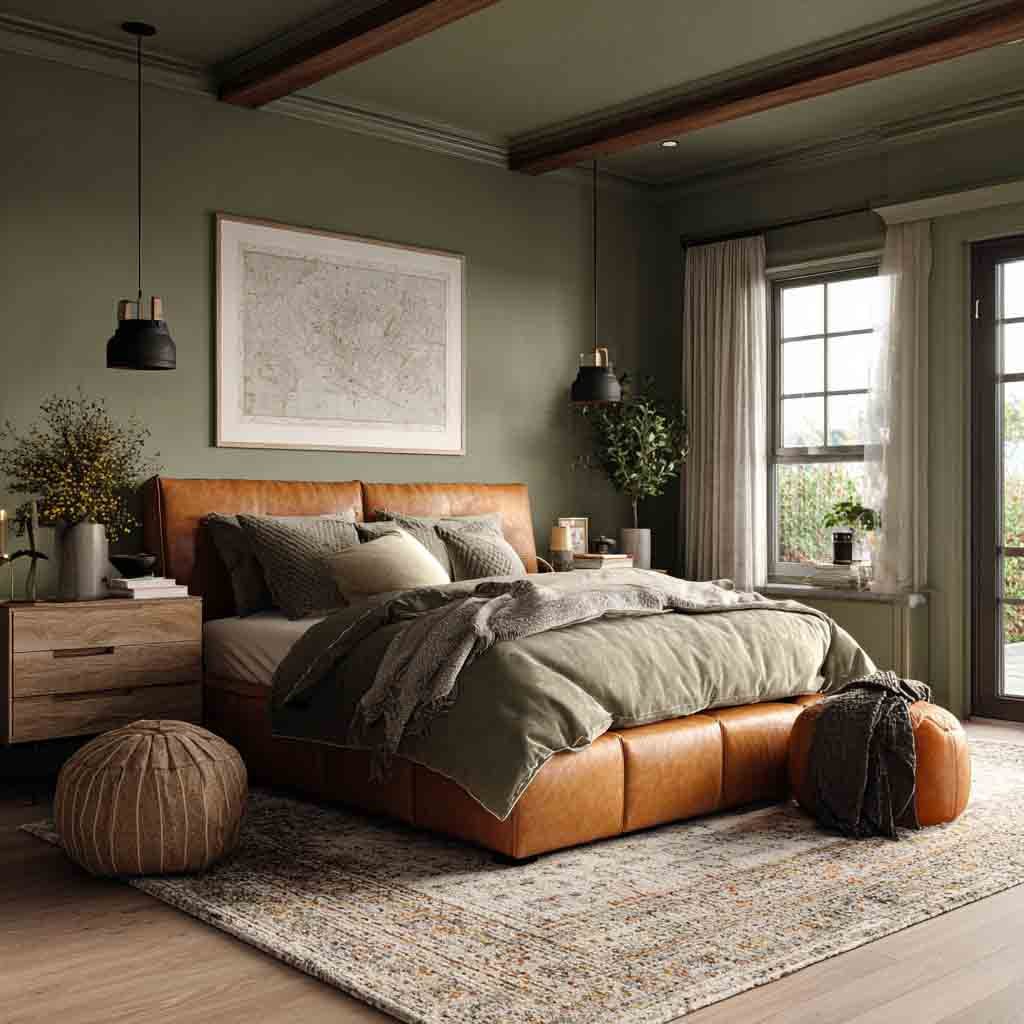
If you want something earthy but a little more serious, olive green is your color. It’s rich and grounding—like bringing the outdoors in.
Why it works:
- Creates a cozy, cocoon-like feel
- Works beautifully with natural and rustic elements
- Timeless, especially in moody or masculine spaces
Design Tips:
- Pair with tan leather, beige, or mustard accents
- Add linen curtains for light contrast
- Looks great in bedrooms with wood beams or dark floors
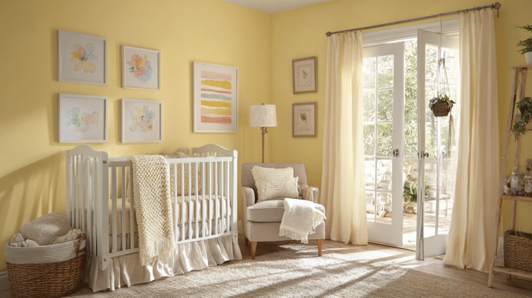
17. Buttercream
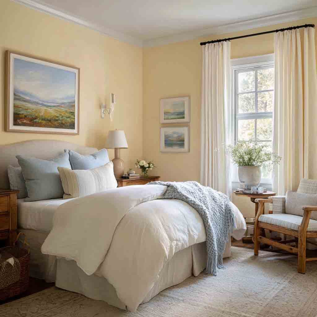
Buttercream is like a warm hug in paint form. It’s soft, subtle, and brings just enough sunshine into your space.
Why it works:
- Brings a cheerful yet relaxing glow
- Warmer than plain white, but still neutral
- Great for cozy, inviting atmospheres
Design Tips:
- Pair with dusty blue or sage green
- Use layered textures—knits, cottons, and woods
- Lovely for farmhouse or classic styles
18. Mushroom Beige
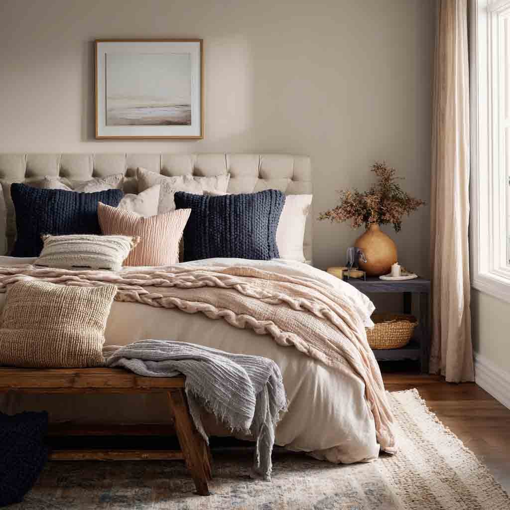
Mushroom beige is that perfect blend of taupe and gray with an organic, earthy undertone. It feels rich but not heavy.
Why it works:
- Soothing, grounded, and perfectly balanced
- A great alternative to classic gray or taupe
- Pairs well with almost any accent color
Design Tips:
- Combine with olive, navy, or blush tones
- Add soft velvet or suede for a luxe touch
- Ideal for modern, transitional, or Japandi styles
19. Whisper White
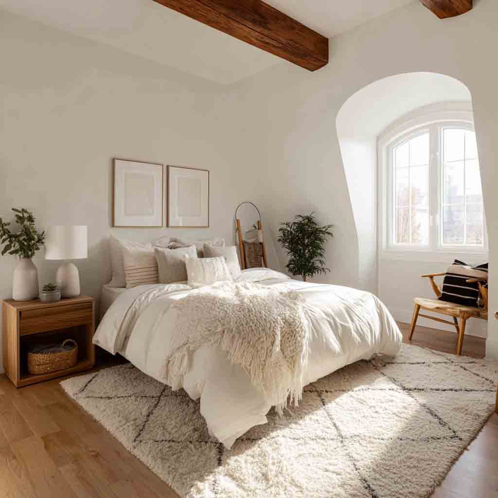
Whisper white has just a hint of beige or gray, making it feel softer and warmer than pure white. It’s subtle but powerful.
Why it works:
- Feels airy, open, and calming
- Adapts to any decor or lighting situation
- Creates a clean slate for layering textures
Design Tips:
- Perfect for small rooms that need brightness
- Works great with woven rugs and raw wood
- Try tone-on-tone white decor for a soft layered look
20. Soft Mocha
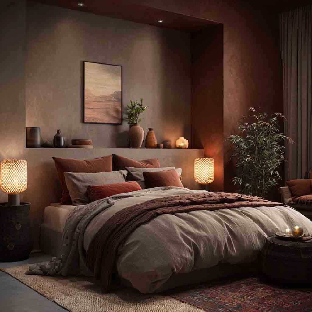
Soft mocha is cozy, creamy, and rich—but without the heaviness of dark brown. Think latte foam rather than espresso.
Why it works:
- Adds depth and comfort without overpowering
- Feels warm, safe, and serene
- Great for autumnal and neutral palettes
Design Tips:
- Use with terracotta, beige, or pale blush
- Add warm lighting for a glowing effect
- Ideal for cozy, layered bedrooms
21. Wisteria Gray
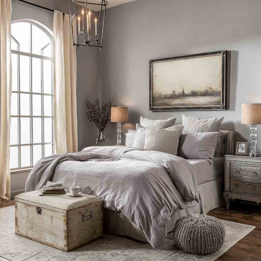
Wisteria gray is a magical blend of gray and purple. It’s subtle, slightly whimsical, and brings a dreamy quality to the space.
Why it works:
- Feels cool, soft, and slightly mysterious
- Works beautifully in low-light bedrooms
- Has a unique, creative feel without being loud
Design Tips:
- Pair with soft white, navy, or silvery accents
- Add velvet pillows or metallic finishes
- Great for romantic or artistic bedroom themes
22. Pale Khaki
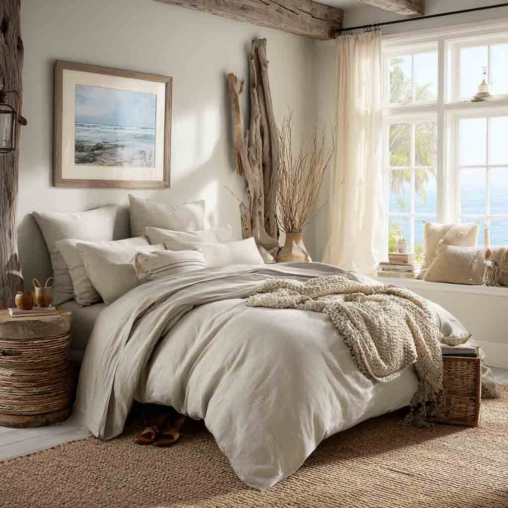
Pale khaki is a soft, sandy beige with just a touch of green. It’s breezy, casual, and totally underrated.
Why it works:
- Evokes calm desert tones and natural vibes
- Perfect for laid-back, beachy spaces
- Doesn’t fight for attention, just supports the vibe
Design Tips:
- Combine with whites, driftwood, or warm grays
- Keep decor simple—cotton, jute, and soft lighting
What to Avoid: Common Mistakes When Choosing Bedroom Paint
Let’s not ruin a good vibe with a bad decision. Here are some oopsies to steer clear of:
- Choosing overly bright or neon colors – These overstimulate your senses.
- Using high-gloss finishes – They reflect light and feel less restful.
- Ignoring your lighting – A color can look totally different in natural vs. artificial light.
- Not testing paint samples – Always swatch before committing.
Pro Tip: Paint a small section on different walls and check it throughout the day.
Wrapping It Up
Honestly, painting your bedroom is one of the easiest ways to completely change how it feels. It doesn’t have to be a huge renovation, just the right color, the right vibe, and a little love.
My advice? Go with what makes you feel good. Calm, grounded, and ready to curl up under the covers.
And hey, if you try one of these shades, I’d love to hear about it.

