22 Trendy Dining Room Paint Color Ideas That Impress Guests
I know how it feels to stand in the paint aisle, second-guessing everything.
You want something that looks nice, feels right, and doesn’t feel like a trend you’ll regret next year. Been there.
A dining room isn’t just a place to eat, it’s where birthdays, morning coffees, and late-night chats happen.
So here are 22 paint colors that make the room feel like yours, personal, warm, and real.
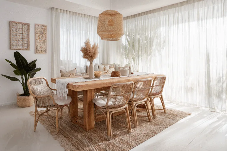
1. Soft Sage Green

I painted my dining wall sage green last fall, and I haven’t looked back since. It’s one of those shades that quietly fills the room without stealing the spotlight.
It plays really well with wood furniture and anything natural, think jute rugs, woven chairs, and simple tableware.
If your dining space gets some sunlight, this color just glows in a way that makes the room feel calm but alive.
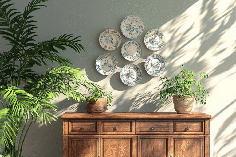
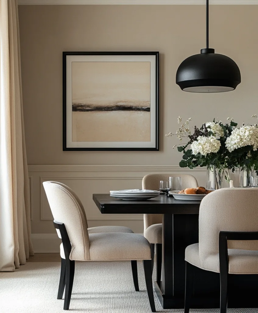
2. Creamy Beige
My aunt swears by beige for her walls, and honestly, she’s right. It’s gentle, warm, and never gets old. You don’t have to worry about clashing furniture or wall art.
If you’re starting fresh and not sure where to go, beige is a safe bet. You can always dress it up or down.
I once used it as a base in a rental and added darker curtains and gold frames, looked like I had it professionally styled.
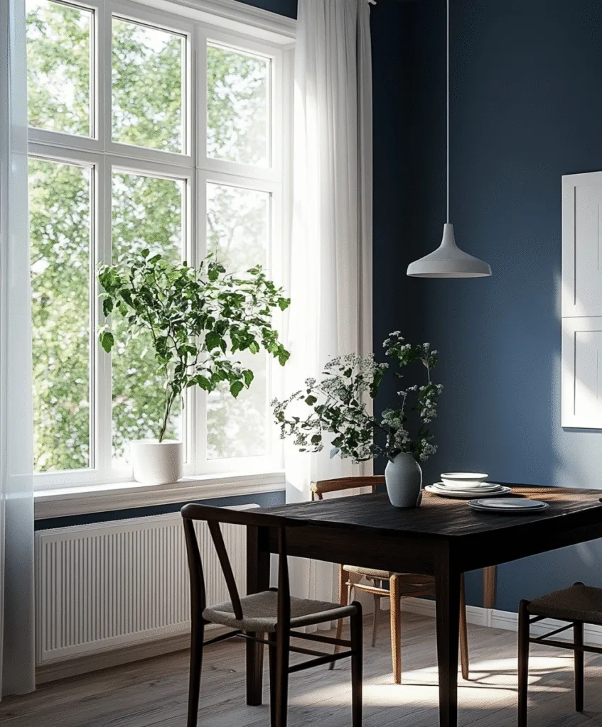
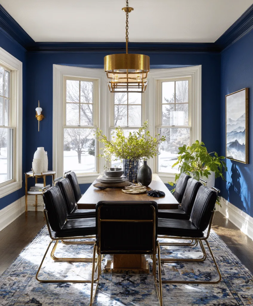
3. Moody Navy Blue
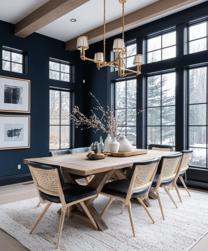
This one’s bold, I tried it in a client’s home, and the result was unexpectedly cozy. It adds depth, especially if your dining room has high ceilings or crown molding.
If you have lighter floors or furniture, the navy helps balance it out. Add a few gold or wood accents, and it really shines.
It’s dramatic without being overwhelming. Think candlelit dinners, not daylight brunches.
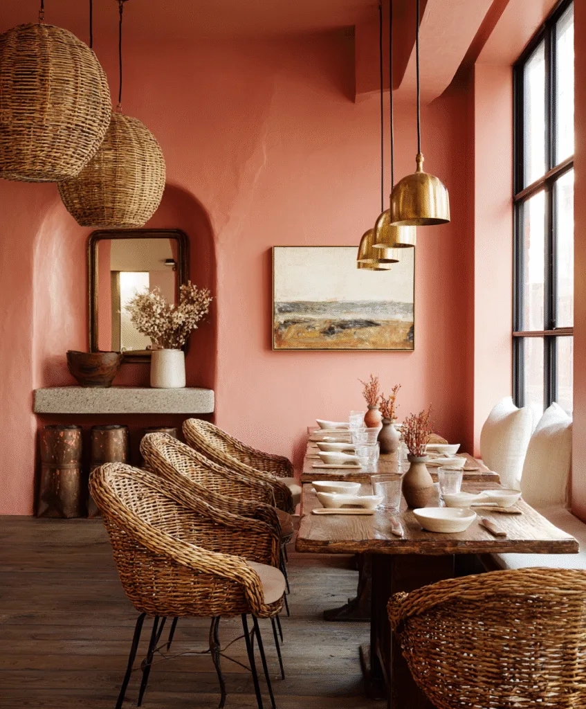
4. Muted Terracotta
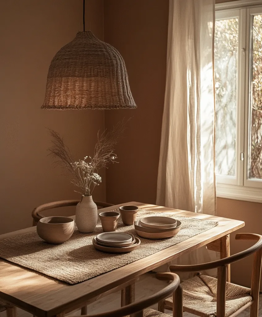
This is the color I always recommend when someone says their dining room feels cold. Terracotta warms everything up, the walls, the mood, even the food feels more comforting.
I helped a friend repaint her dull gray room with this, and suddenly it felt like a Mediterranean café.
If you like rustic touches or have pottery and baskets, this shade is right at home.
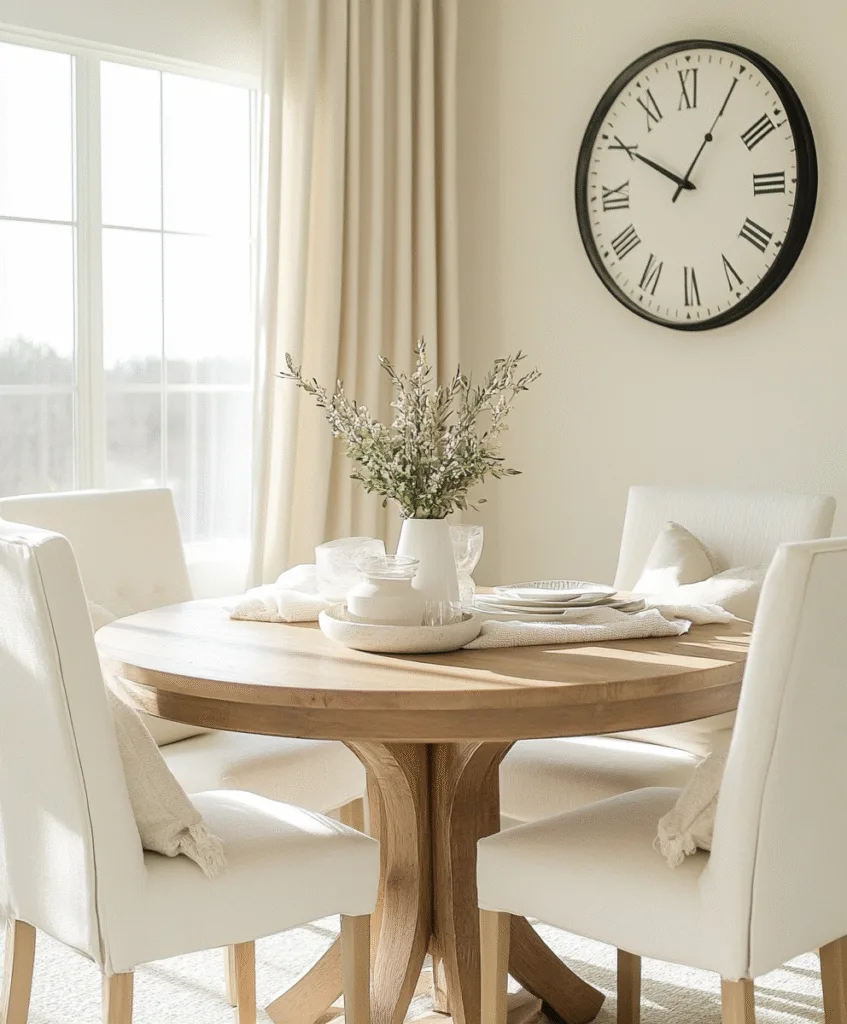
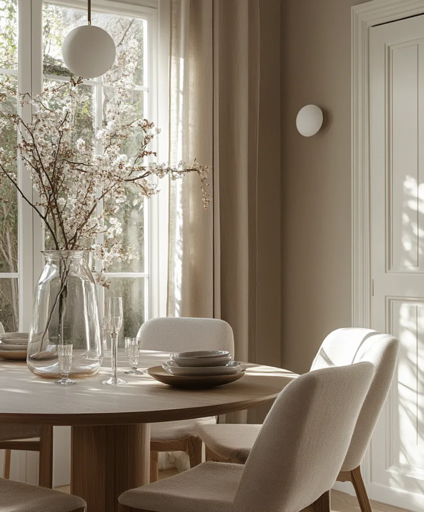
5. Warm White
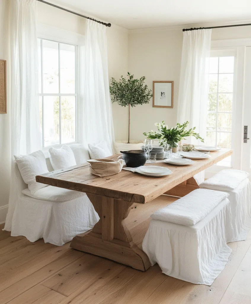
Sometimes, the simplest option really is the smartest one. I painted my mom’s dining room in warm white, and it instantly felt cleaner and bigger.
It doesn’t distract, and that’s what makes it so good. You can switch up your décor anytime without worrying about matching it to the wall.
If you’ve got good lighting, natural or not, this is an easy win.
6. Dusty Blue
Blue can be tricky, but dusty blue? That’s a winner. I used it in a beach house dining room and it made everything feel calm and breezy.
It pairs nicely with neutrals, white, beige, even soft grays. You don’t need much else to make the room feel finished.
It’s not flashy. It’s the kind of color that just feels right when you’re sitting down for dinner.
7. Olive Green
I’ve always loved how olive green makes a room feel grounded. It’s cozy without being dark. If you like vintage furniture or anything handmade, this is a natural fit.
A client had an antique table, and this color brought out every little detail in the wood.
Plus, it holds up well with everyday life, smudges and marks don’t scream at you.
8. Blush Pink
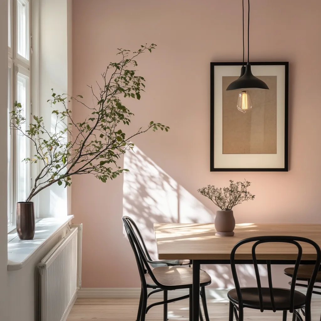
Before you scroll past this one, hear me out. Blush isn’t bubblegum. It’s soft, subtle, and honestly kind of elegant.
I used a muted blush in a small dining nook, paired it with black chairs, and it felt surprisingly sophisticated.
If you’re nervous about going pink, test a patch near a window. You might be surprised how gentle and mature it looks.
9. Charcoal Grey
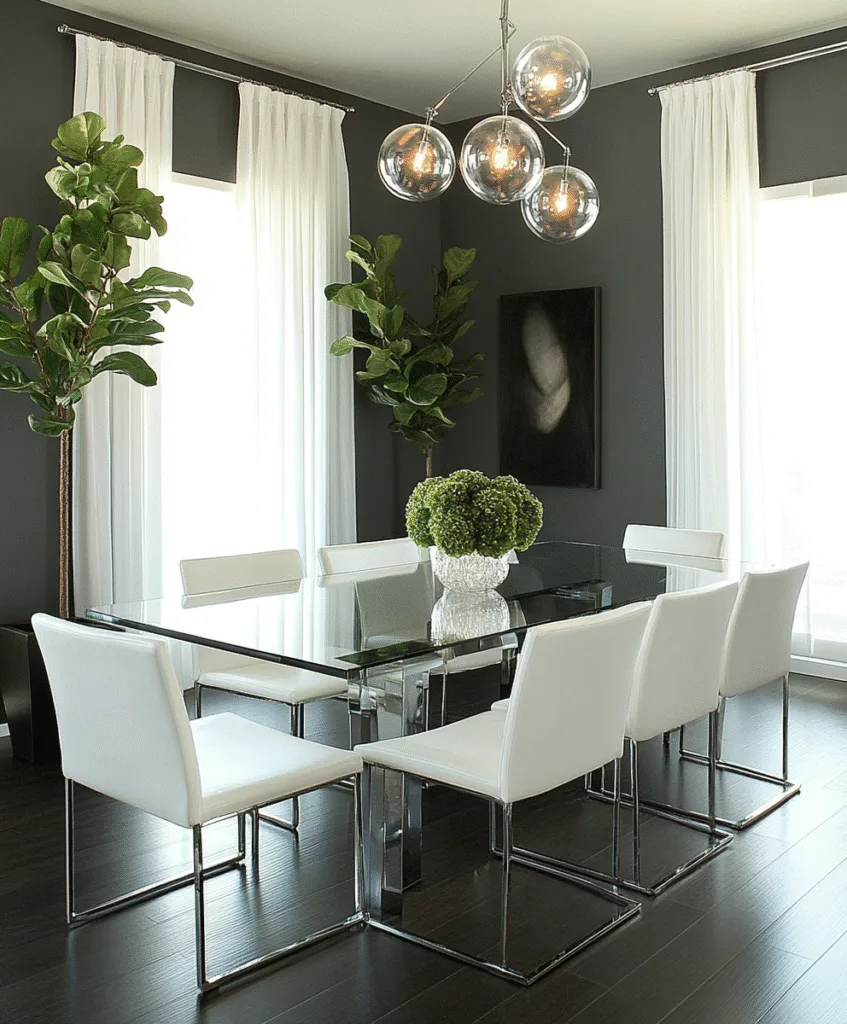
Dark, yes, but hear me out. Charcoal adds a certain seriousness to a space without making it feel cold.
I used this in a home where the dining area opened into a white kitchen. That contrast made both rooms pop.
If you keep the furniture light and simple, the dark walls actually make the room feel cozier, not smaller.
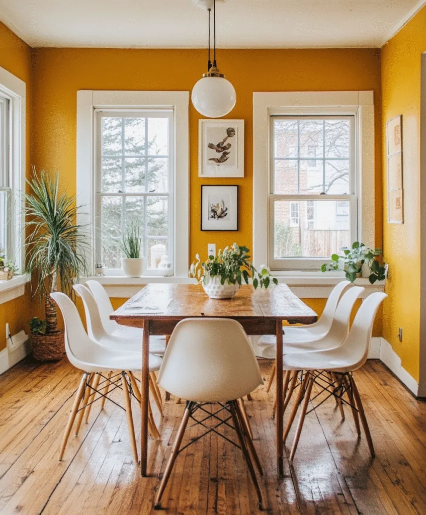
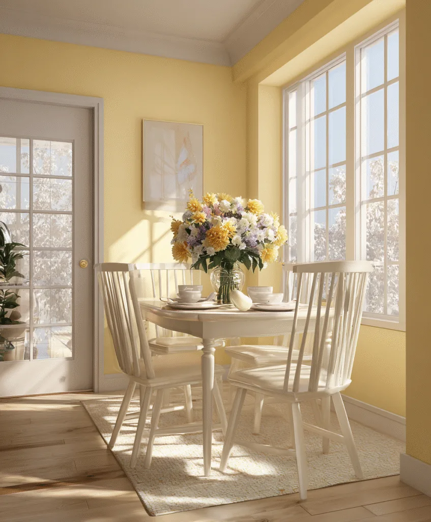
10. Pale Yellow

This one reminds me of my grandmother’s dining room, warm, cheerful, and full of sunlight. I’ve used pale yellow in a few makeovers where the space felt lifeless.
Just make sure to pick the right tone, soft like butter, not school bus.
It works really well if you’ve got white trim, wicker chairs, or even light wood furniture.
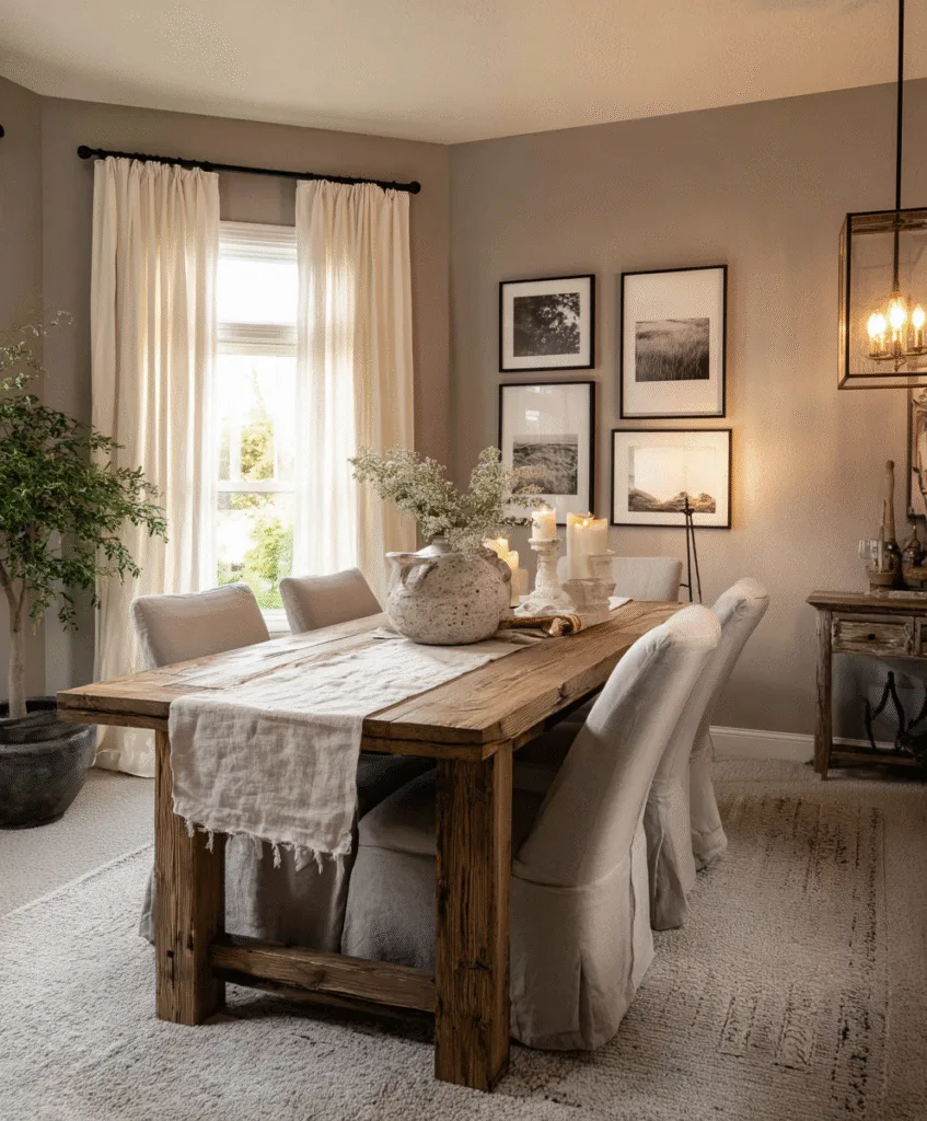
11. Greige
This is my go-to when people want neutral but not boring. Greige has just enough beige to feel warm and enough grey to feel modern.
Depending on the light, it shifts a bit throughout the day, which keeps things interesting.
I once paired this with black picture frames and a dark dining set, it balanced everything out beautifully.
12. Deep Plum
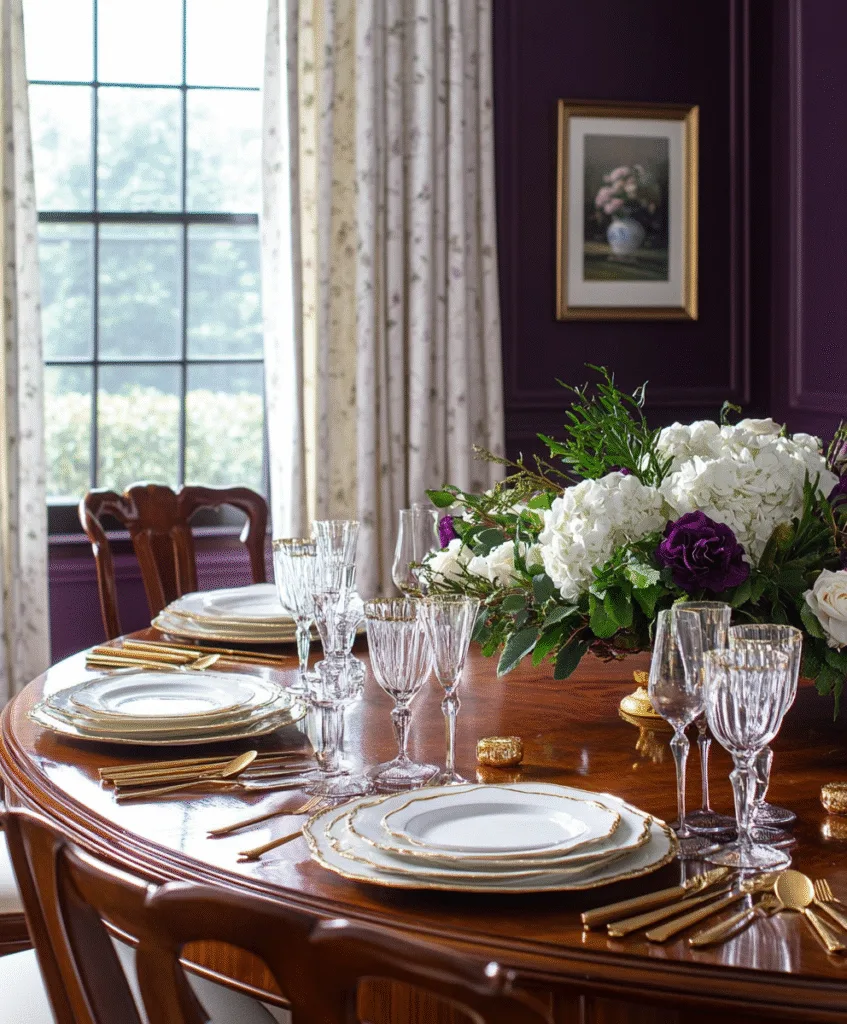
Now this one’s for those who like a little drama. I had a client ask for something “unexpected”, and plum did not disappoint.
It adds richness, especially with white curtains or gold hardware. Don’t overdo the accessories, let the walls speak.
It’s bold, but if you keep the rest of the room soft, it works surprisingly well.
13. Mushroom Taupe
Mushroom tones are sneaky-good, not too brown, not too grey. I used this in a small dining space once and it instantly made the room feel more put-together.
It’s a solid choice if you’re into natural textures, rattan, burlap, raw wood all pair well with it.
If you want something neutral but slightly richer than beige, this sits right in that sweet spot.
14. Burnt Mustard
I know mustard sounds bold, but a toned-down version feels surprisingly cozy. I helped a friend paint a mustard accent wall, and it brought life to her white furniture.
This color has a vintage vibe without looking dated. It works especially well in older homes or with farmhouse-style tables.
Just stick to one wall or lower half, otherwise it might overpower the space.
15. Slate Blue
Slate blue is one of those grown-up colors that feels calm but interesting. I used it in a narrow dining room with white trim and it gave the room a quiet confidence.
It’s cool without being icy. Works well with both dark and light wood finishes.
If you like the idea of blue but want something more grounded, this one’s a winner.
16. Terracotta Pink
This isn’t your soft pink or coral, it’s got depth and a touch of earthiness. I once used this color for a boho-style dining nook and paired it with woven lighting, stunning.
It works really well with tan leather, brass fixtures, or anything handmade-looking.
It’s warm and a little unexpected, but still feels welcoming.
17. Dusty Lavender
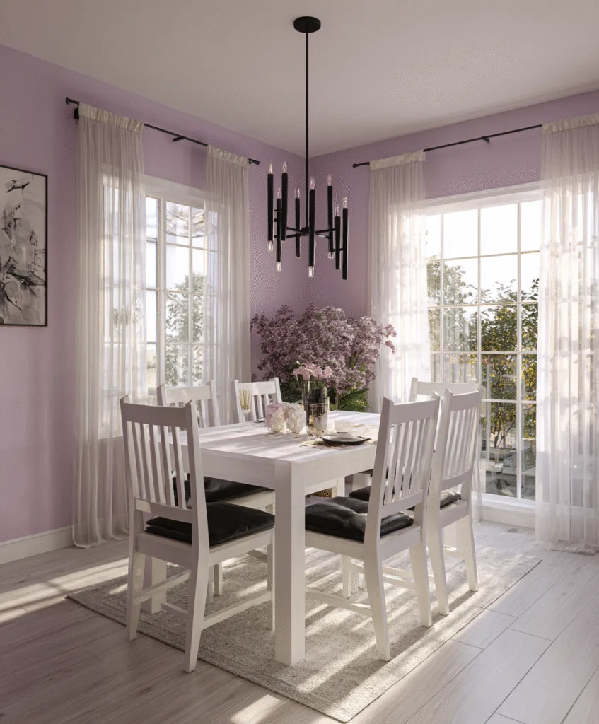
I never thought I’d like purple in a dining room until I saw dusty lavender in a client’s space, it was soft, slightly moody, and actually elegant.
It works great with matte black finishes or creamy whites. Avoid anything too shiny, let the color do the work.
If you’re looking for something romantic but grown-up, try this.
18. Soft Mocha
Think milky coffee on your walls, that’s soft mocha. I used it in my sister’s house and it gave her dining space a soft warmth without being too dark.
It works well with light textiles, think white or cream curtains, neutral art, nothing too busy.
It’s one of those colors that makes the room feel cozy even when it’s empty.
19. Cobalt Blue
Cobalt is bold, no doubt, but in the right room, it’s electric in a good way. I used it in a home with large windows and high ceilings, and it just made everything pop.
If you’re going for modern, add clean lines and black accents. If more classic, try gold or antique wood.
Start small, one wall or below a chair rail. It makes a statement without yelling.
20. Buttercream
This one feels like sunshine without the glare. I used it in a dim dining room that always felt gloomy, and this color changed everything.
It’s richer than plain yellow but still soft enough to go with most décor.
Add in fresh flowers or light wood furniture, and it just sings.
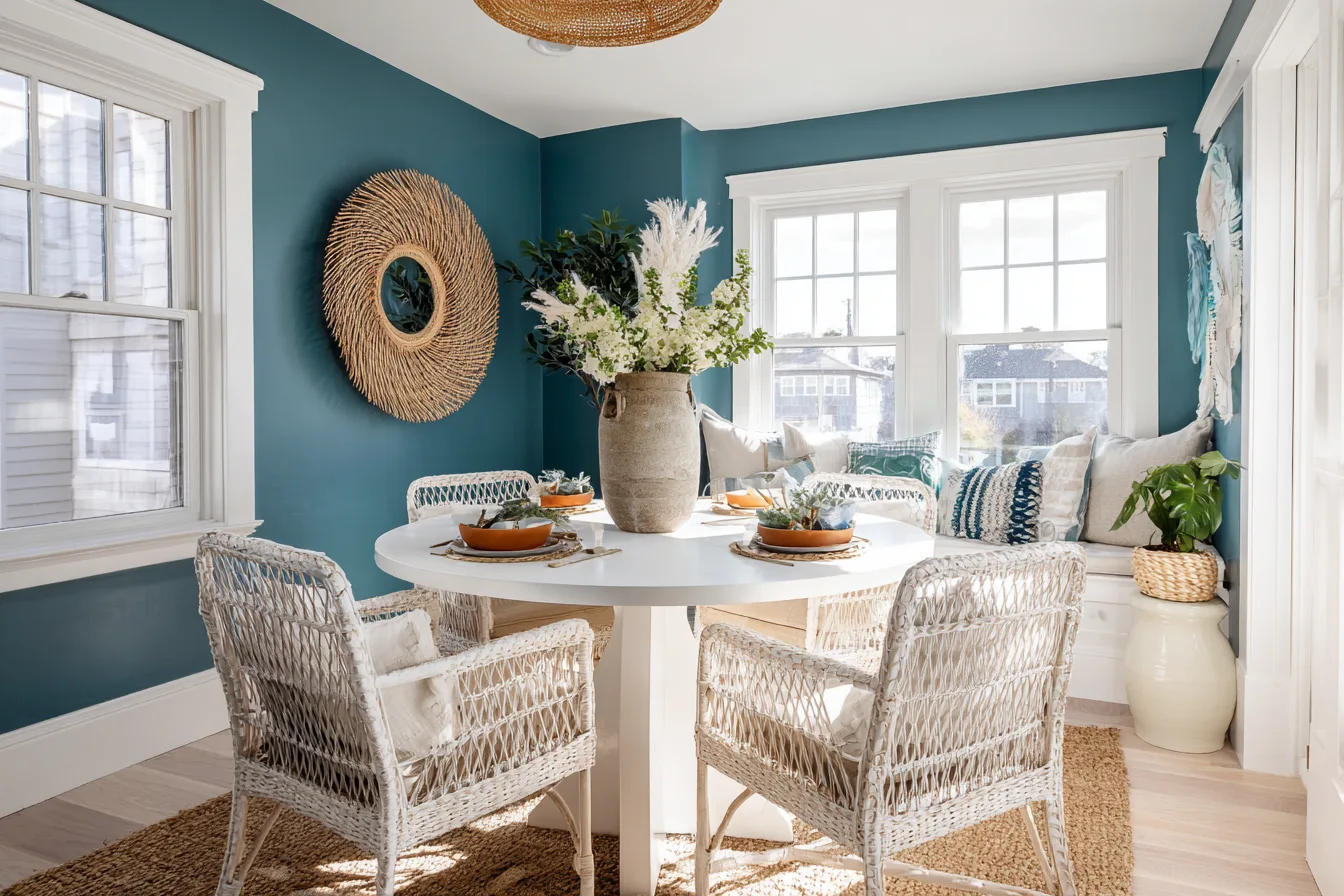
21. Smoky Teal
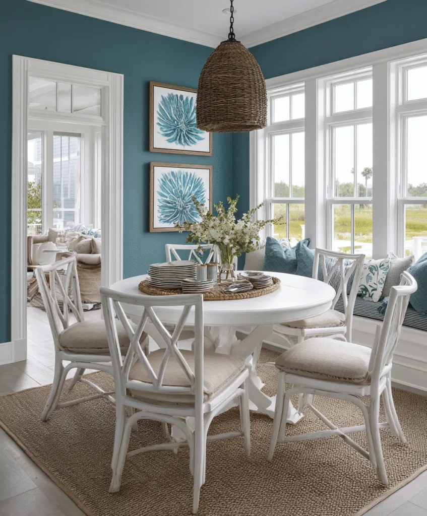
Teal can be loud, but smoky teal is more chilled out. I used it in a client’s coastal-themed dining area, and it made the space feel fresh without screaming “beach house.”
It looks great with whites and sandy tones. Also plays nicely with metals like brass or brushed nickel.
It’s one of those colors that feels clean but not cold.
22. Antique White
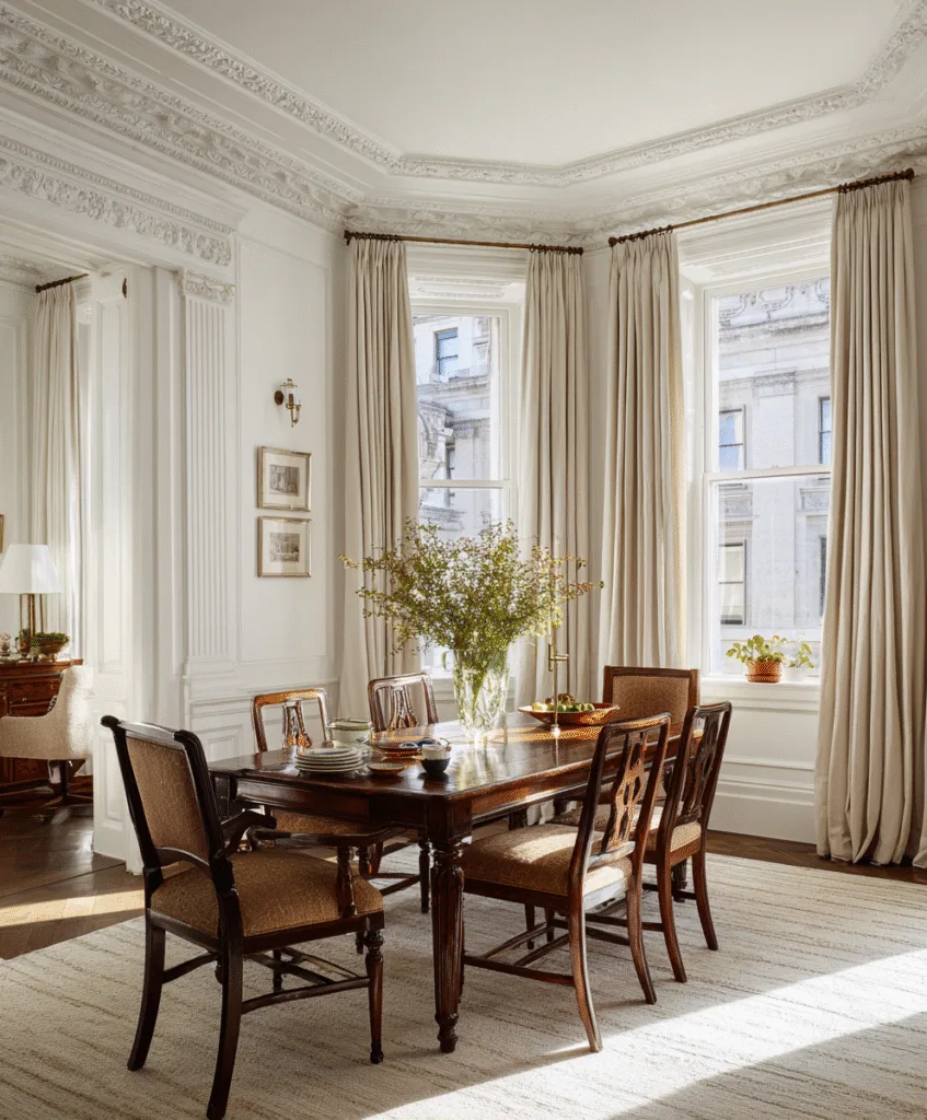
This isn’t plain white, it’s got a drop of cream or even peach in it. I’ve used it in several older homes where bright white felt too modern.
If your space has crown molding or textured walls, antique white helps highlight those little details.
It gives the room warmth without ever getting in the way of your furniture or wall décor.
Conclusion
Paint’s not just color on a wall, it sets the mood for the whole space. You don’t need to follow what’s trendy or what everyone on social media is doing.
What you need is something that feels like home when you sit down for dinner.
Try samples. Test the light. And trust your gut. You’ll know when it feels right.